Using the Chart Wizard
PERMISSIONS Users with security levels that allow the creation of LiveReports. Any security level in Autotask can be configured with this permission. Refer to Configure access to LiveReports Designer.
NAVIGATION Left Navigation Menu > Admin > Admin Categories > Features & Settings > LiveReports > LiveReports Designer
About charts
Charts are used to display series of numeric data in a graphical format. The data is represented by symbols such as bars in a bar chart, lines in a line chart, or slices in a pie chart. They make it easier to understand large quantities of data and compare key pieces of information like changing trends, or summarized totals.
Charts must contain at least one numeric data element (a "series") that is being graphed; typically this element is an aggregate (Sum, Count, Average, Minimum or Maximum). For example, you may want a count of the number of tickets in each queue and compare that number to the total number of tickets.
You can put more than one chart on a report. This allows you to see different representations of the same data, or charts of different data groupings, such as a chart which summarizes data by each month, and another which shows totals for a whole year.
TIP The data you are graphing does not actually have to be shown on the report. You can suppress it by placing it in a row, clicking on the row number for that row and choosing Suppress Rows. For more information about row options, refer to Sections, rows, and columns.
How to...
You access the Chart Wizard from the LiveReports Designer page.
- To open the page, use the path(s) in the Security and navigation section above.
- Open a LiveReport in Edit mode.
- Click a cell in the Group Footer or Report Footer section to place the chart in.
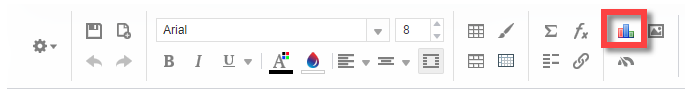
- Click the
 chart icon in the Tools menu.
The Chart Wizard will open.
- To navigate through the wizard, click the desired tabs or use the navigation buttons located at the bottom of the page.
IMPORTANT Charts use the calculations made on the report itself. Therefore, you cannot place a chart at the top of the page because no data has been calculated yet. Always place your chart at the end of the report.
TIP Use the merge cells option to combine multiple cells for the chart, or resize the cell to the dimensions required for the chart, or it will appear very small.
Use this tab to select the chart type that is appropriate for your report. The following chart types are available:
| Chart Type | Description |
|---|---|
| Line and Area Charts | |

|
Line Charts are used to display trends over time. They consist of a series of data points connected by straight lines. Line charts can be single-series (one line), or multi-series (multiple lines). On a multi-series chart, lines are differentiated by color. The X-axis is typically the timeline, the Y-axis displays the values. EXAMPLE Use this type of chart to graph "New Tickets by Month" or "Sales Revenue by Quarter". |

|
Spline Charts display a series of data points connected by an interpolated curve. They are a variant of a Line Chart. The curve between data points is an estimation; it does not represent actual data values. |

|
Area Charts are line charts in which the area below each line is filled with color. They are generally used to compare the cumulative totals of different Data Fields over time. They can be thought of as a variation of a Line Chart and are created in a similar fashion. On a multi-series chart, each series is given a distinct color, and the colors blend where series areas overlap. Area charts are created in the same manner as Line charts. |

|
Spline Area Charts are spline charts in which the area below each spline is filled in. They are generally used to compare the cumulative totals of different Data Fields over time. They can be thought of as a variation of a Line Chart and are created in a similar fashion. On a multi-series chart, each series is given a distinct color, and the colors blend where series areas overlap. Area charts are created in the same manner as Line charts. |

|
Zoom Line Charts are variations of a standard line chart. Zoom line charts have the same basic construction and components of a line chart, but allow you to zoom in and out to see more or less data points. |
|
|
A Statistical Process Control (SPC) Chart is a graph used to study how a process changes (usually over time). Data is plotted in time order. SPC charts always have a central line for the average, an upper line for the upper control limit and a lower line for the lower control limit. Control limits are located 3 standard deviations above and below the centerline (mean). Data points outside of the limits are indicative of an out-of-control process. |
| Bar and Column Charts | |

|
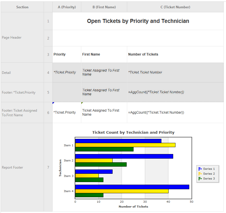
Bar Charts use rectangular bars that extend horizontally to show comparisons between categories. Each data value is represented by a bar, the length of which represents its quantity. Bar charts can be single-series (one bar per category) or multi-series (multiple bars per category, each series differentiated by color). EXAMPLE Use this type of chart to graph "Ticket Count by Technician and Priority". |

|
Stacked Bar Charts are a variation of a multi-series Bar chart. Each bar is a category of data values stacked additively. The length of the bar represents the total quantity of the category, and each segment represents the data value in proportion to the total. Each series is differentiated by color. Stack bar charts can be created in the same manner as multi-series Bar charts. |

|
100% Stacked Bar Charts are a variation of a multi-series Bar chart. Each bar is a category of data values stacked additively. The length of the bar is fixed to 100%, and each segment represents the data value as a percentage of the total. Each series is differentiated by color. Stack bar 100% charts can be created in the same manner as multi-series Bar charts. |

|
Column Charts use vertical bars to compare values across categories. Each data value is represented by a column, the height of which represents its quantity. Column charts can be single-series (one column per category), or multi-series (multiple columns per category, each series differentiated by color). Column charts are created in the same manner as Bar charts. |

|
Stacked Column Charts are a variation of a multi-series Column chart. Each column is a category of data values stacked additively. The length of the column represents the total quantity of the category, and each segment represents the data value in proportion to the total. Each series is differentiated by color. Stack column charts can be created in the same manner as multi-series Bar charts. |

|
100% Stacked Column Charts are a variation of a multi-series Column chart. Each column is a category of data values stacked additively. The length of the column is fixed to 100%, and each segment represents the data value as a percentage of the total. Each series is differentiated by color. Stack column 100% charts can be created in the same manner as multi-series Bar charts. |

|
Pareto Charts are a special type of single series chart that contains both bars and a line graph, where individual values are represented in descending order by bars, and the cumulative total is represented by the line. EXAMPLE Use this type of chart to analyze the frequency of problems or causes, for example in a Tickets by Issue Type report. |
| Pie & Other Single Series Charts | |

|
Pie Charts are used to display the contribution of each value (slice) to a total (pie). Pie charts always use one data series. EXAMPLE Use this type of chart to graph "Open Tickets by Queue". |

|
Doughnut Charts are Pie Charts with a hole in the center. |

|
A Pyramid Chart is a variation of a Pie Chart in which the data sections are represented as “slices” on a Pyramid. The area of each slice is proportional to the quantity it represents. |

|
A Funnel Chart is a variation of a Pie Chart in which the data sections are represented as
“slices” on a Funnel. The area of each slice is proportional to the quantity it represents. It can
be thought of as a “reverse” Pyramid Chart. EXAMPLE Use this type of chart to graph "Open Opportunities by Stage". |
| Combination Charts | |

|
Combination Charts are several different charts layered on top of one another. They comprise a combination of Column, Line, Area, and/or Stacked Column charts. (Column and Stacked Column charts are not compatible with each other). Combination charts can have up to two Y-axes. |

All chart types can also be displayed in 3D.
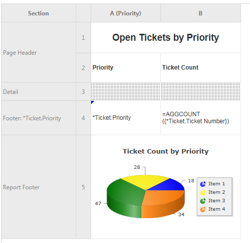
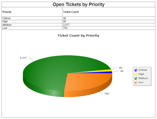
For reports with a single numerical series, a pie chart or one of its variations is the most appropriate. Here is an example of a report where we counted the number of tickets for each priority:
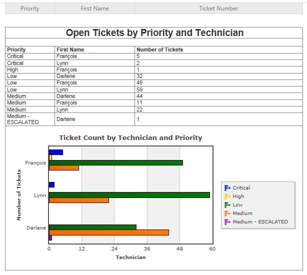
Here is what that chart looks like after the report is run:
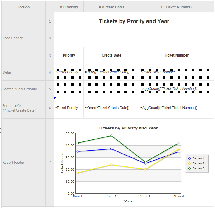
If we added the element of time to the report ("Entity 1 (Tickets) by Entity 2 (Priority) and Time Entity (Year)"), a pie chart or its variations would not work. Here, you want to select a line or area chart to show trends over time.
If time is not a factor but you are looking at multiple series ("Entity 1 (Tickets) by Entity 2 (Priority) and Entity 3 (Technician)"), a bar or column chart is usually most appropriate.
TIP If you have long data labels, a bar chart is usually better than a column chart.
Here is what that chart looks like after the report is run:
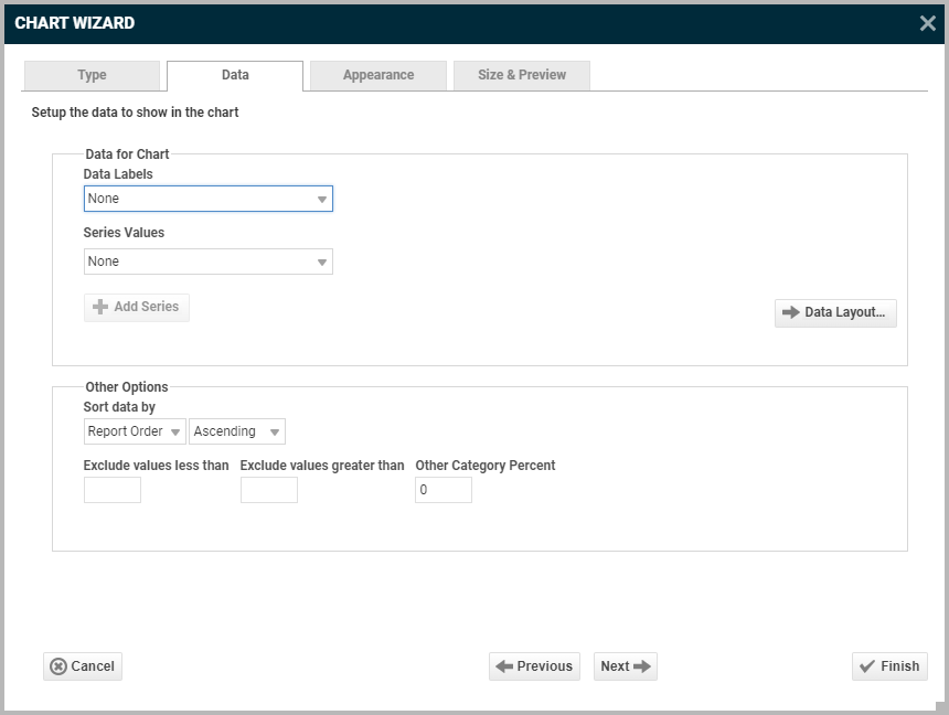
On the Data tab, you specify which cells are used as data values for the chart. You can also choose a sort order, as well as upper and lower boundaries for the data and axes.
Fields differ, depending on the type of chart:
| Name | Description | Applies to |
|---|---|---|
| Data for Chart | ||
| Data Values | Click the dropdown and select the numerical cell you want to graph. | Line, Pie, Bar, Pareto |
| Data Labels | Click the dropdown and select the cell that contains the label for the numerical data you are graphing. | Line, Pie, Bar, Pareto |
| Series Labels | If your chart contains only a single series, select None. Otherwise, select the cell that contains the series label you want to display on the chart. | Line, Bar |
| Data Layout | Click Data Layout to choose between a Cell Based Chart, Column Based Chart or Row Based Chart. For more information, refer to Data layout. | All |
| Other Options | ||
| Sort Data by | Report Order – The chart will follow the order of the information on the report.
Data Labels – The chart will be sorted by the data labels (either alphabetically or numerically). Data Values – The chart will be sorted by the data values. You can sort data in Ascending (A- Z, 0-9) or Descending (Z-A, 9-0) order. |
|
| Exclude values less than | Ignores values less than the specified value. | |
| Exclude values greater than | Ignores values greater than the specified value. | |
| Other Category Percent | Groups the un-categorized data into a single percentage | |
Data layout
LiveReports offers three Data Layouts, or options, for specifying how to chart your data. Each data layout is intended for reports that have a specific data structure.
Click one of the icons at the top of the Data Layout window and click OK.
Cell Based Chart
Cell based charts are not very common. They are for building a specific type of single-series chart using a collection of static points on your report.
EXAMPLE You want the report to list the number of sales for all salespeople, but only want to graph the number of sales made by three specific salespeople.
The categories (salespeople) you want to graph data (number of sales) for would be specifically named on the Data Tab of the chart.
Column Based Chart
Both column based charts and row based charts are for creating multi-series charts, but there are some important differences in the report designs they work with. Column based charts are appropriate if you want to show two or more unrelated y values for a single x value. It is also possible to make a dynamic single-series chart using this layout.
EXAMPLE You would like to show the number of leads received and sales made by each salesperson.
You would like to show the sales and expenditures and remaining budget for each internal location.
Column based charts are the default layout, but for many Autotask reports it is not the right option, so you should always check.
Row Based Chart
Row based charts are appropriate if you want to compare two or more related y values for a given x value.
EXAMPLE You would like to show the number of tickets resolved per technician per year.
You would like to show the sales totals by salesperson by month.
Row based charts are the right option to select if aggregated data values are grouped by one or more categories.
On the Appearance tab, you specify chart colors, labels and fonts.
| Field | Description |
|---|---|
| Colors | |
| Colors | Select the colors for your chart. The Default selection will pick the colors for you. If you select Linear Range, select a starting color and an ending color from the color selectors provided. If you select Custom , a number of colors will be selected and you can click the plus sign |
| Use 3D Style | Check to display the chart in 3D. |
| Labels | |
| Chart Title | Optionally, enter a title for the chart. |
| X-axis Title, Y-axis Title | Optionally, for graphs that feature a coordinate grid, enter the title you want to appear below the horizontal and to the left of the vertical axis. |
| Point Labels | Use this dropdown to display or hide point labels. Options are: None • Data Values- In a pie chart, this would be number of tickets or amount of revenue. • Percent of Data Values- Shows what percentage of the total each slice represents. • Data Labels - Shows the category label for each slice. • Data Labels with Data Values - Displays both category and numbers. Not all options are available for all chart types. |
| Legend Position | Use this field to hide or display the chart legend and choose its location. |
| Font | Select a label font from the dropdown. The default is Arial. |
| Number Format | Defaults to the cell format. To modify the number format, clear Use Cell Format and edit Decimal Places, Separator Symbol, Currency Symbol and append "%" to the numbers. |
| Benchmark Lines | Add horizontal lines to the chart that show a goal or threshold. Click New and complete the following: • Label - Enter the text you want to appear as the label of the benchmark. • Value - Specify the numeric value you would like to define as the benchmark. The benchmark line will display horizontally at this value. • Color - Use the color picker or type in a custom hex value to specify the color of the line. • Line Style - Specify either a Solid or Dashed line. To remove the benchmark, click the Delete icon. |
| Other Features | |
| Other features | This section contains a list of common chart attributes that can be customized.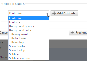 To add a custom attribute, select one from the drop-down and click the Add Attribute button. Then use the picker or type a custom property into the text field. To remove a custom attribute, click the Delete button. |
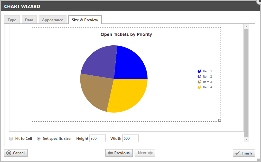
The Size and Preview tab allows you to change the size of the chart and see how it will appear on the report.
You can change the size of the chart in one of three ways:
- Select Fit to Cell and re-size the chart cell on the Design Grid.
- Select Set specific size and type a custom Height and Width (in px) into the selection fields
- Click and drag the outer boundary of the chart by dragging the handle in the bottom right corner


